Interactivity
- ashleighdwan

- Sep 12, 2016
- 2 min read
I touched on multimedia storytelling a few weeks ago but I'm going to delve into it again.
Last week Matt Liddy, editor of interactive digital storytelling at the ABC, came to speak to us about the importance of story interaction and engagement.

He gave some sound advice on what it's like to work in the world of online and made the following points.
Rich content matters
“Making sure news organisations are delivering increasingly rich content is important and it’s what people want” – Mark Zuckerberg
There is no one right way to tell the story
Start with audience
Think digital from the start
Make sure it's right for a digital space, think pictures/video/data etc.
Interactivity is expensive
It's expensive for both the creator and consumer as it takes time. Consumers, or the audience, invest more time as they may have to learn how to use the story.
Don't forget about the story/the job is only partly done when you publish
With technology these days, news organisations can see exactly when and why people are clicking on stories. If it's not getting much traction a simple change in headline can boost numbers so it's important to track it after publication.
If it doesn't work on mobile, it doesn't work
Ignore Facebook at your own peril
By all means learn to code - but that's not the only path
The best way to get started is to just... get started
There are a whole bunch of free programs out there to kick-start your online interactive storytelling. Poynter do a great job in explaining why some of the most basic programs work well.
Check out the link to have a read.
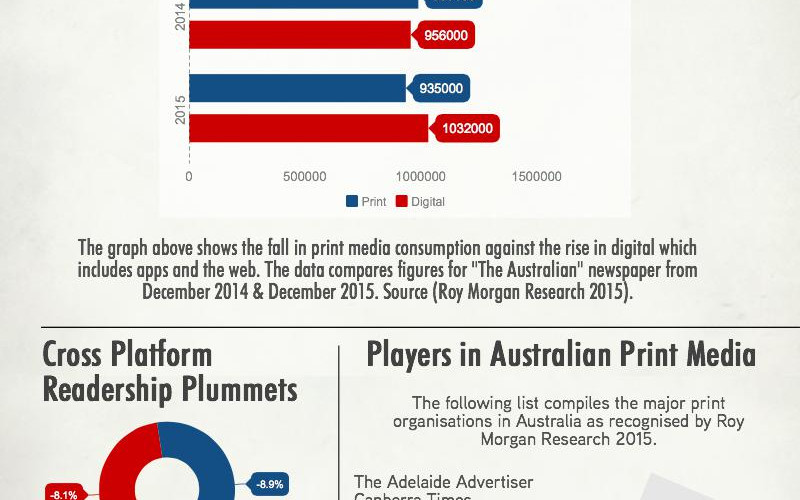
I, too, have had a little experience in adapting content for online and have used a few programs to help me create different aspects of a story. Piktochart is one of my favourites as it creates data visualisations and large graphics which show key points.
I created the following for a group assignment last semester where we identified "Secrets of Success" for upcoming journalists. I really liked the "Australian News Readership" infographic because it broke down key data statistics but displayed it in a digestible and visual way. This particular visualisation depicts trends in newspaper consumption and fits perfectly with the paper layout. Easy templates like this really add value to assignments and news stories.


Other data visualisations can be created using Infogram and Datawrapper.
Timelines are also a great way to give the audience some more interaction and Timetoast does this well.
Storify is also excellent for live blogging and breaking news whereas Shorthand Social works well with longer form features and investigative pieces.
I can understand that this post may sound full of jargon for many of you, those not studying journalism, but I hope you can appreciate the small efforts the media is going to to ensure you engage with and react to compelling informational stories.
Comments